Role
Duration
Tools
Team

Project Overview
As the company evolved, its existing identity needed a clearer position and a more distinctive visual system. I led the rebrand across strategy, positioning, and visual identity—from defining the brand direction to creating the logo, color, typography, and broader brand system.
The Challenge
SaaSify operates in a crowded space where many brands look and sound the same.
The challenge was to create an identity that moved beyond generic SaaS and cloud aesthetics while clearly communicating what SaaSify actually brings to its customers: clarity, direction, and expertise.
Goals
Create a clearer brand position.
Establish a distinctive visual identity.
Build a flexible system that could scale across touchpoints.
Move away from predictable cloud and SaaS visual language.
Finding the Direction
Conversations before design
The process began with conversations with the people behind SaaSify.
Understanding how they saw the company, its customers, and the challenges they solve helped uncover a consistent theme: SaaSify helps businesses navigate an ecosystem that can otherwise feel complicated and unfamiliar.
That led to the central idea behind the brand.
Wayfinding
SaaSify helps businesses find their way through the cloud marketplace ecosystem.
Wayfinding became the strategic foundation of the brand—a concept centred around understanding where you are, where you need to go, and how to get there.
It gave the brand a direction that was rooted in what SaaSify actually does rather than simply what industry it operates in.
From there, I began rapid ideation — scribbling logo concepts, testing visual metaphors, and identifying typefaces that reflected Clazar’s bold, modern, and slightly rebellious spirit.
The Brand Personality
The identity combines qualities from two archetypes:
The Sage brings expertise, clarity, and guidance.
The Ruler brings structure, confidence, and direction.
Together, they helped shape a brand that feels knowledgeable and authoritative without becoming cold or overly corporate.
Origami
Origami became an important visual metaphor for the identity.
A series of folds transforms something simple into something structured and purposeful. That idea aligned with SaaSify's role in bringing clarity and structure to complex cloud journeys.
This became the starting point for the logo exploration.
The Logo
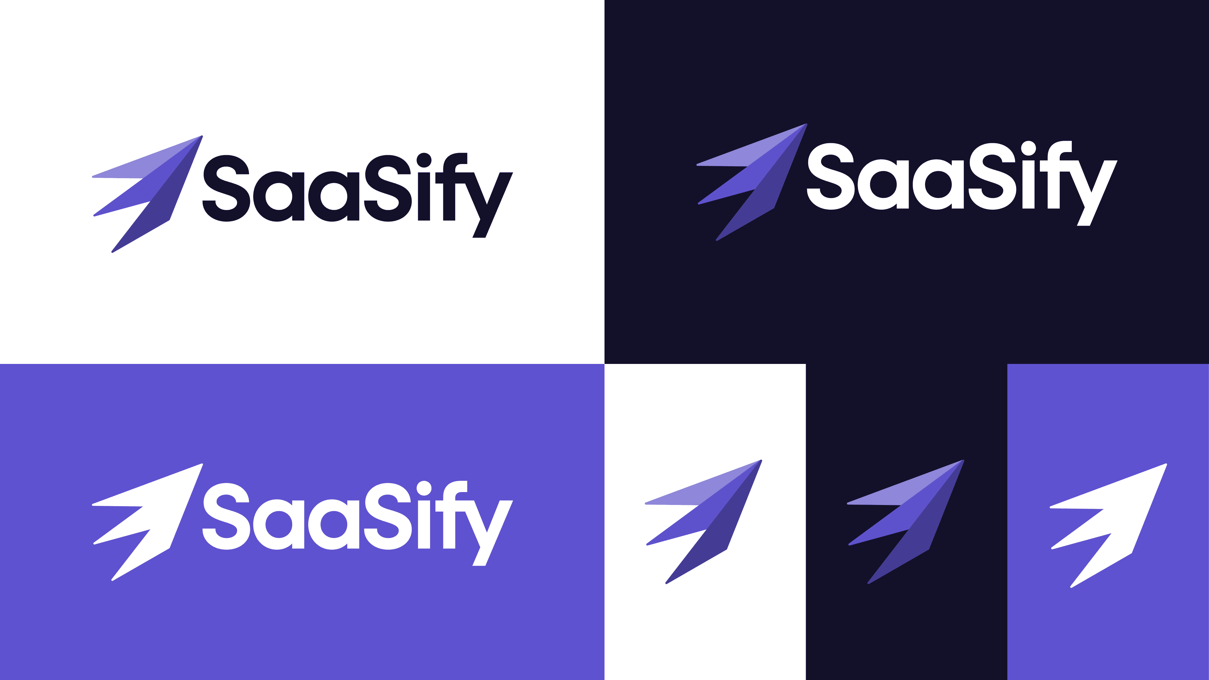
The final mark combines folded geometry with a sense of forward movement.
It represents direction without relying on the obvious visual clichés of arrows, clouds, or generic technology symbols.
The result is a distinctive mark designed to feel dynamic, structured, and recognisable across different applications.
A Flexible Identity System
The logo was developed as a system rather than a single asset, with variations designed for different scales, backgrounds, and applications.
The broader visual identity extended the same ideas through:
Color
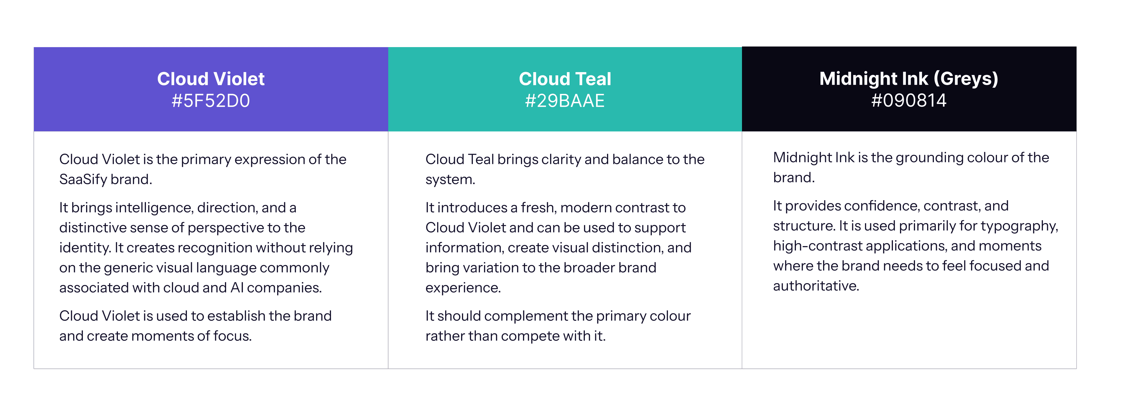
The SaaSify color palette represents the brand’s personality.
Cloud Violet is the primary color and it should be used the most.
Cloud Teal is the accent color, used for emphasis.
Midnight Ink is for neutrals and text.
Typography
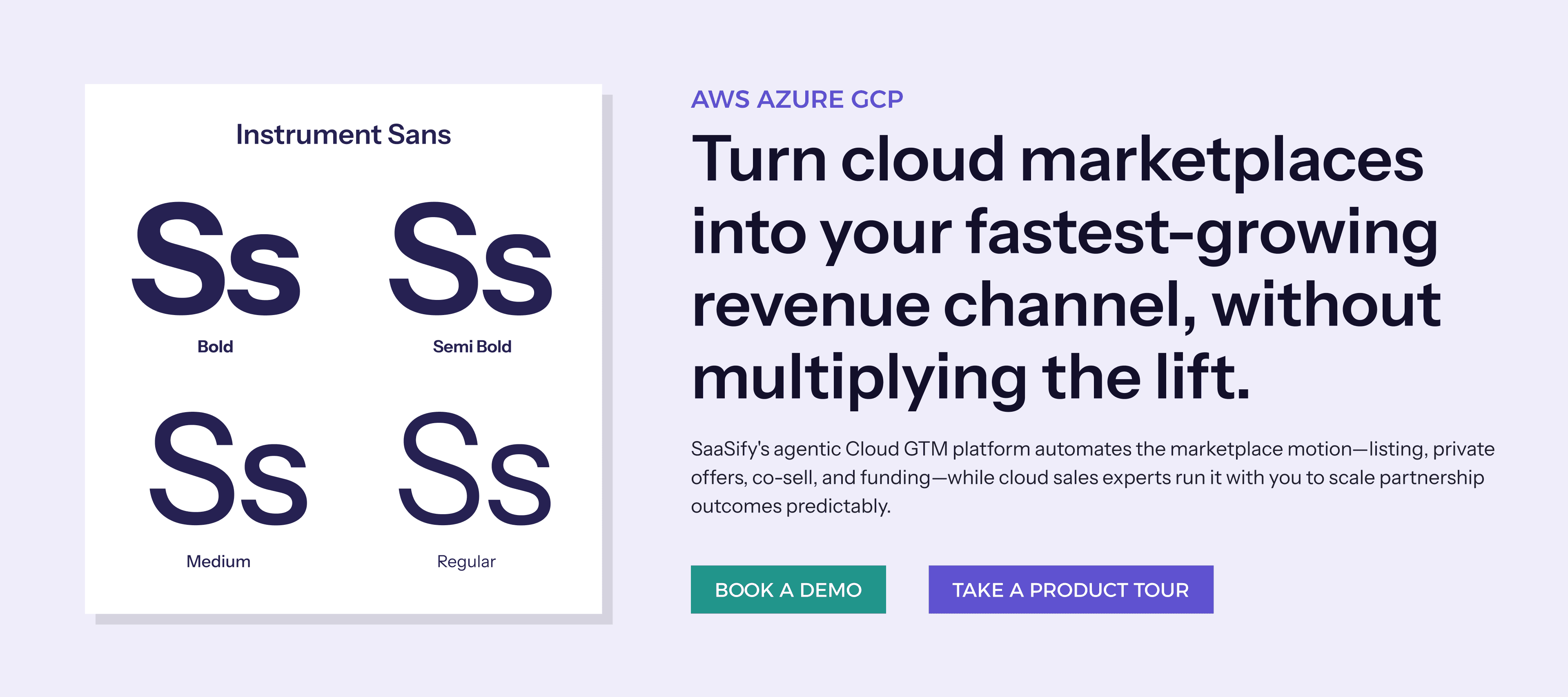
A clean and structured type system that prioritises clarity while giving the brand a confident presence. I've used Instrument Sans and the brand font. It's a sans serif typeface from Google fonts that has enough personality to work with headings, and is legible and clear for body copy.
Visual Language
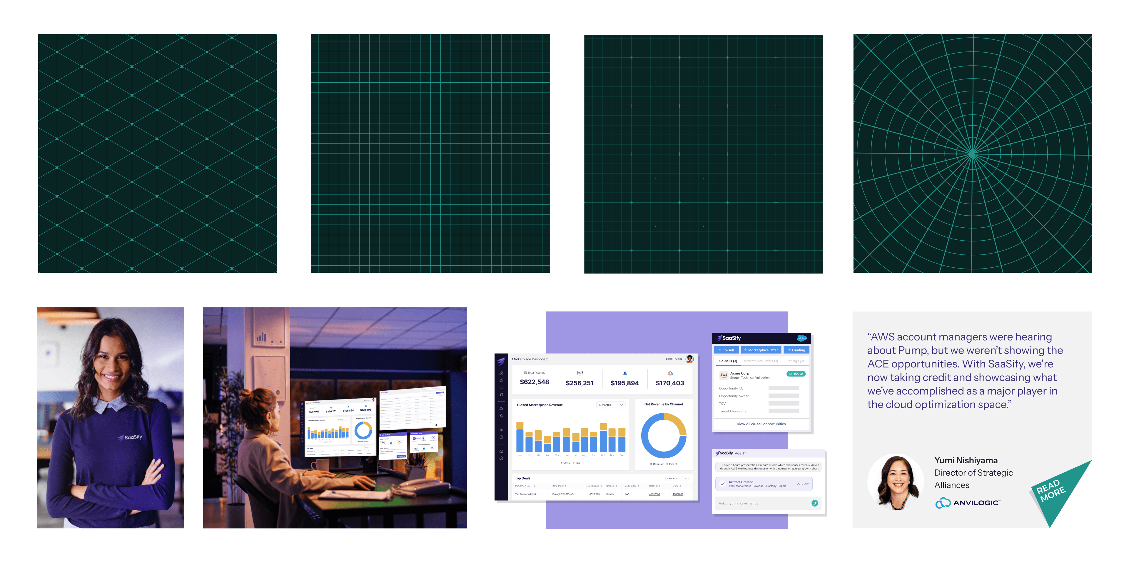
The visual treatment is defined keeping in mind the inherent characteristics of Wayfinding and Origami.
Direction: Visual movement should help guide the viewer through information.
Folding: Forms can transform, overlap, or reveal new information.
Shadows: Sharp, 11 o clock shadows for cards used with cards and geometrical shapes.
Layering: Different elements can be overlapped to communicate complexity.
Perspective: Use depth and angled planes to create a sense of movement and progression.
Pointed corners: All buttons and shapes need to have a corner radius of zero or 2.
Building the Brand
The final brand system was designed to work across multiple touchpoints—from digital experiences and product communication to presentations, social media, and physical applications.
The goal wasn't to create a collection of rules.
It was to build a system that SaaSify could grow with.
The Website
The new website became one of the first major applications of the rebrand.
The identity system was designed to work with SaaSify's content rather than simply sit on top of it. The bold typography creates hierarchy and clarity, while the brand colours and graphic elements introduce moments of energy throughout the experience.
The folded geometric language derived from the logo is used across the website as a recurring visual element—creating direction, framing content, and adding movement without overwhelming the information.
The system also needed to accommodate a significant amount of product information. SaaSify's platform covers multiple aspects of cloud GTM, including listings, private offers, co-selling, funding, and revenue management. The website needed to communicate this complexity clearly while maintaining a strong and recognisable brand presence.
See the website here: https://saasify.ai/
Impact
SaaSify's rebrand happened in August 2026, so it's still too early to measure long-term business impact.
What the rebrand has done is give SaaSify a clearer and more distinctive presence in a crowded market—moving it away from generic SaaS aesthetics and towards an identity rooted in what the company actually does:
Helping businesses find their way through complexity.

