Role
Duration
Tools
Team

Project Overview
Tamnoon is a managed cloud security platform that bridges the gap between CNAPP findings and actual remediation, taking security teams to the last mile that most tools never reach. At the heart of the platform is Tami, Tamnoon's Cloud SecOps agent, who embodies the brand's identity: sharp, expert, and driven to resolve.
Challenge
The existing brand guidelines lacked strategic clarity around voice, archetype, and color intent. As the platform evolved and Tami became more central to the product experience, the brand needed to reflect a more confident, technology-forward identity that felt less passive and more like a seasoned expert who gets things done. Additionally, Tamnoon's relationship with the CNAPP ecosystem needed to be repositioned: not as a critic, but as a completion layer.
Goals
Define a clear brand archetype that reflects Tamnoon's positioning as a knowledgeable, driven, expert-led platform
Introduce Tami as the living embodiment of the brand
Establish an intentional color system with clear roles for each color
Visualize the brand's dual archetype and core values in a way that could live in the guidelines document for the company to follow across all touchpoints
Process
The refresh began with a series of strategic conversations with Tamnoon's CEO, Marina, to understand where the brand needed to evolve. The key tension we worked through was between being bold and being expert. The answer was sharp and driven, grounded in deep knowledge rather than volume.
From there, I worked iteratively to refine the brand archetype, expanding on the Sage as the primary identity — knowledgeable, self-assured, and focused on completion — supported by the Caregiver as a secondary voice that brings reliability and human validation.
I also clarified the color system, assigning intentional roles to each color rather than leaving them open to interpretation: Forest Lime as the recognizable brand signature, Forest Green as the authority and foundation, Techy Blue as a representation of the cloud security ecosystem and core values, and Neutral Dark as the grounding base.
To bring the archetype to life visually, I developed a stacked identity bar diagram — three proportional bands, with Sage the largest to signal that expertise leads, Caregiver in the middle, and Techy Blue at the base anchoring the brand values of trust, scalability, problem-solving, reliability, boldness, and integrity.
Solution Highlights
Brand Archetype - The Guardian Sage
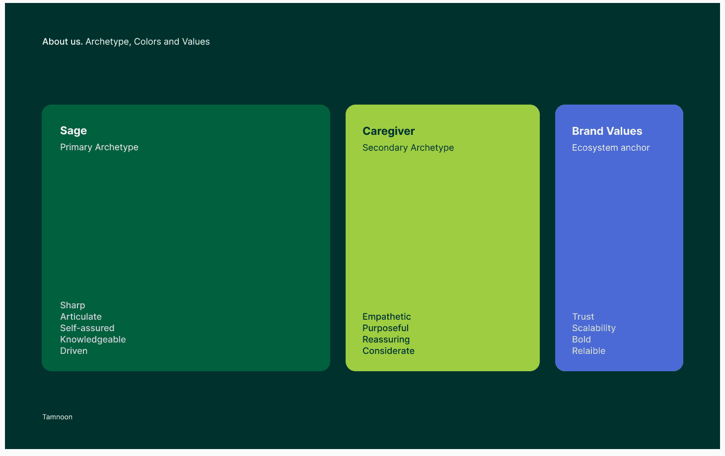
Tamnoon is the expert who gets things done. Sharp, self-assured, and deeply knowledgeable about cloud security. The Sage leads; the Caregiver supports. Together they define a brand that is driven and empathetic, but never loud for the sake of it. A clean, proportional bar diagram communicating the brand's layered identity at a glance — archetype personality in the top two bands, core values in the third, with traits listed outside each bar for readability.
Tami - The Face of Tamnoon
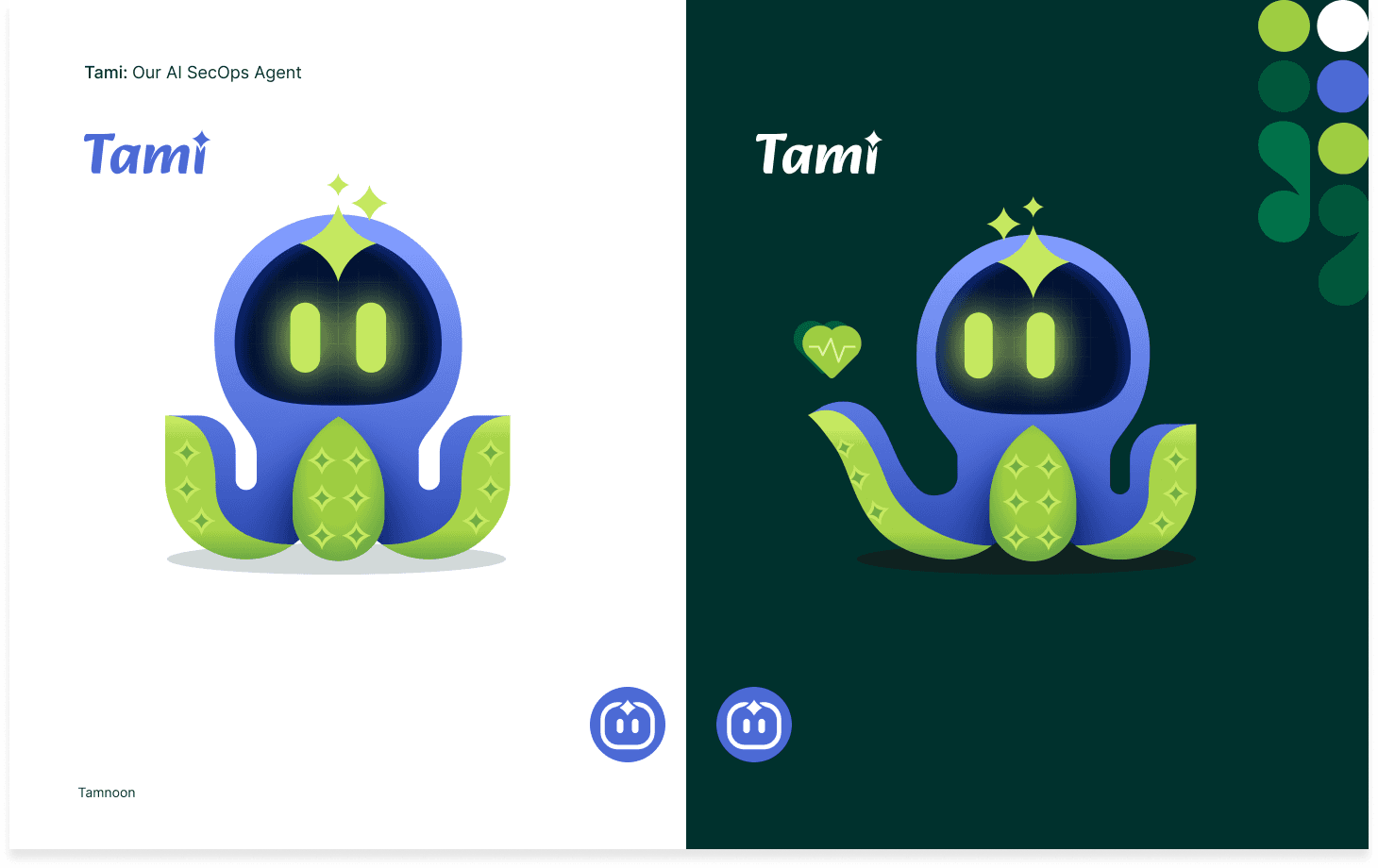
Tami is Tamnoon's Cloud SecOps agent and the brand made real. She investigates, prioritizes, recommends, and remediates — closing the gap between what CNAPPs surface and what security teams actually need to resolve. She doesn't just surface the problem. She solves it.
Brand Values Integration
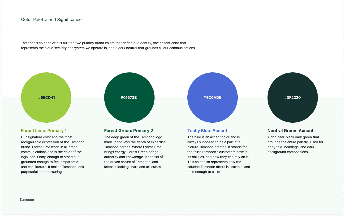
Rather than a new archetype, Tamnoon's CEO's six core values — trust, scalability, problem-solving, reliability, boldness, and integrity — were embedded into the existing framework and anchored visually to Techy Blue, giving the accent color added meaning and strategic purpose.
Impact
The refreshed guidelines gave Tamnoon a clearer, more confident brand identity to build from — one that reflects who they actually are rather than a generic security company. The archetype, voice, color system, and visual framework now work as a unified system, giving the marketing team a strong foundation for content, design, and positioning decisions as Tami and the platform grow.

