Role
Duration
Tools
Team

Project Overview
Tamnoon's website was updated to reflect the refreshed brand guidelines and evolving product — ensuring that ICPs land on a site that communicates who Tamnoon is today. This involved a full content overhaul, a structured design system built in Figma, and a set of reusable components to keep future updates fast and consistent.
Challenge
As the brand and product matured, the existing website no longer told the right story. The positioning around Tami, the CNAPP completion narrative, and the refined brand voice all needed to come through clearly — and the visual system needed to be scalable enough that the team could maintain it without starting from scratch each time.
Goals
Align the website with Tamnoon's updated brand identity and voice
Update product messaging so ICPs immediately understand what Tamnoon does and why it matters
Build a repeatable design system in Figma — typescale, color tokens, and modular components — to make future iterations faster and more efficient
Elevate the visual quality of the site through considered illustrations, animations, and UI patterns
Process
The update started with the design system foundations — establishing a clear typescale and a structured color library using tints and shades of the brand palette, so every element on the site would feel intentional and on-brand.
From there, I built out the core components as reusable Figma elements, ensuring consistency across every section and making handoff and future edits significantly more manageable.
Content was rewritten in parallel to reflect Tamnoon's updated positioning — expert-led, driven, and CNAPP-completion focused — with Tami front and center as the face of the platform.
Solution Highlights
Typography
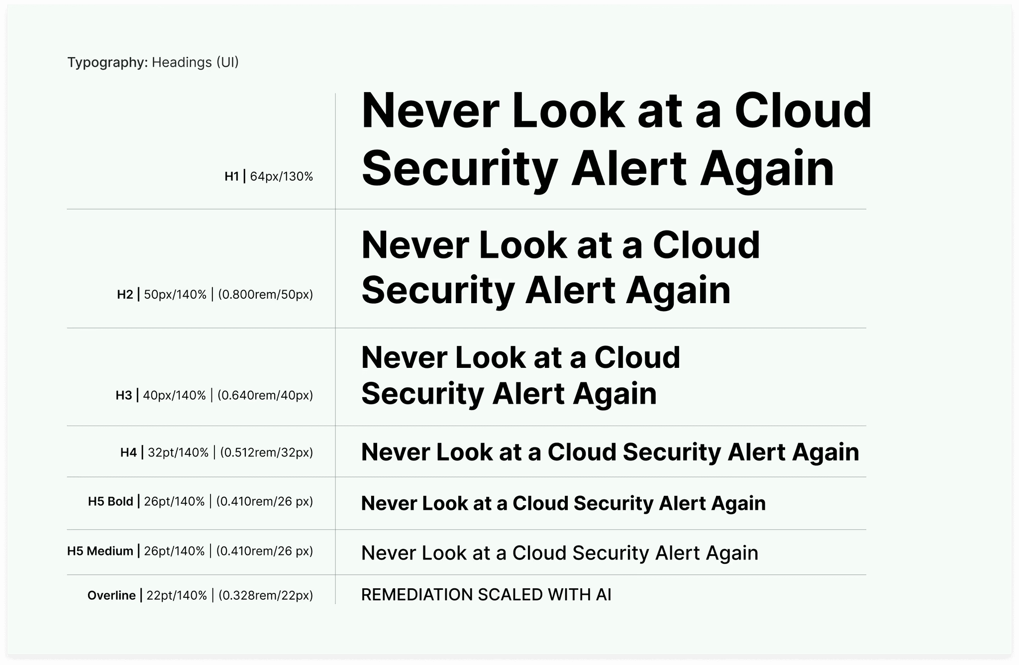
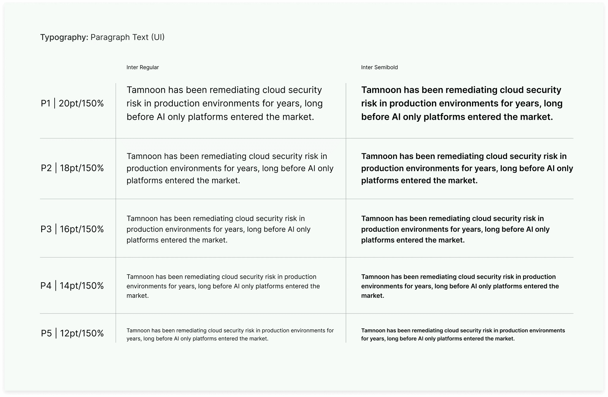
A defined type system that establishes clear hierarchy across headings, body copy, and UI labels, applied consistently throughout the site.
Color System
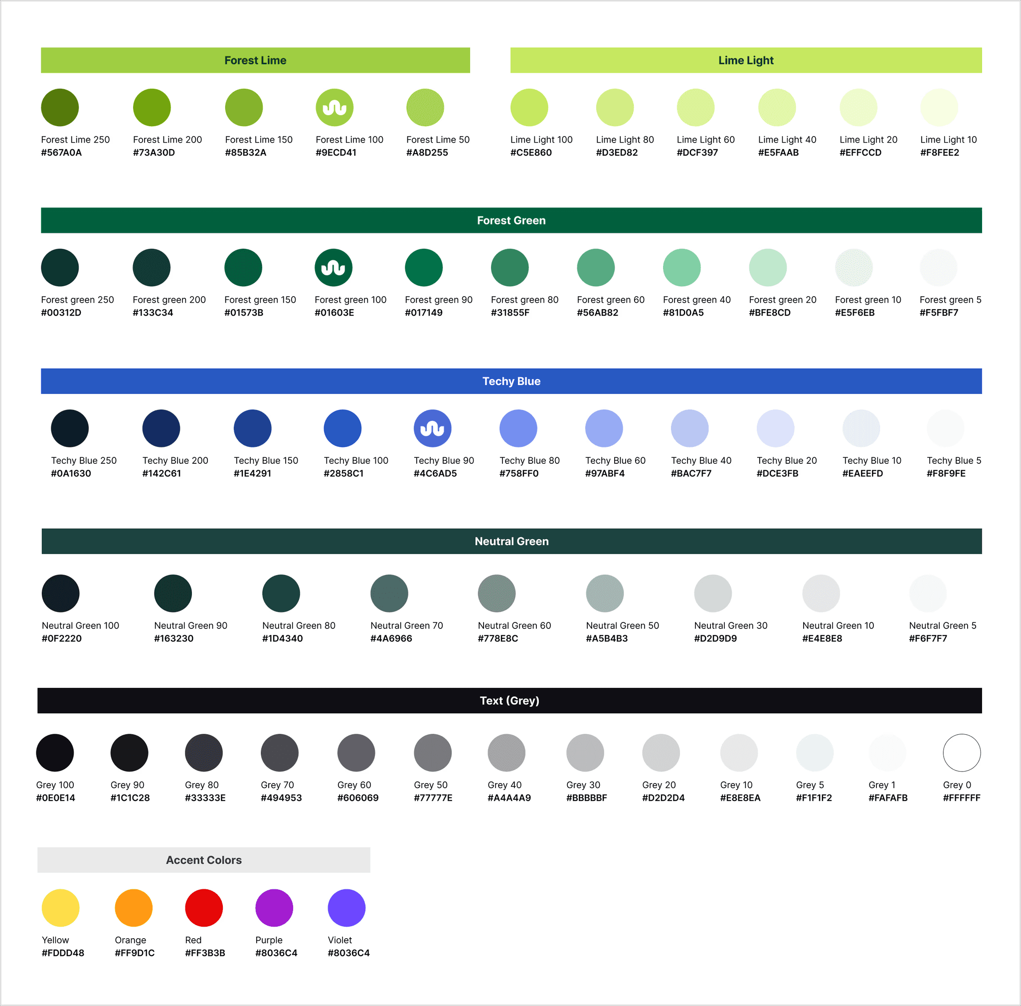
Tints and shades of Forest Lime, Forest Green, Techy Blue, and Neutral Dark, giving the design flexibility while staying firmly within the brand palette.
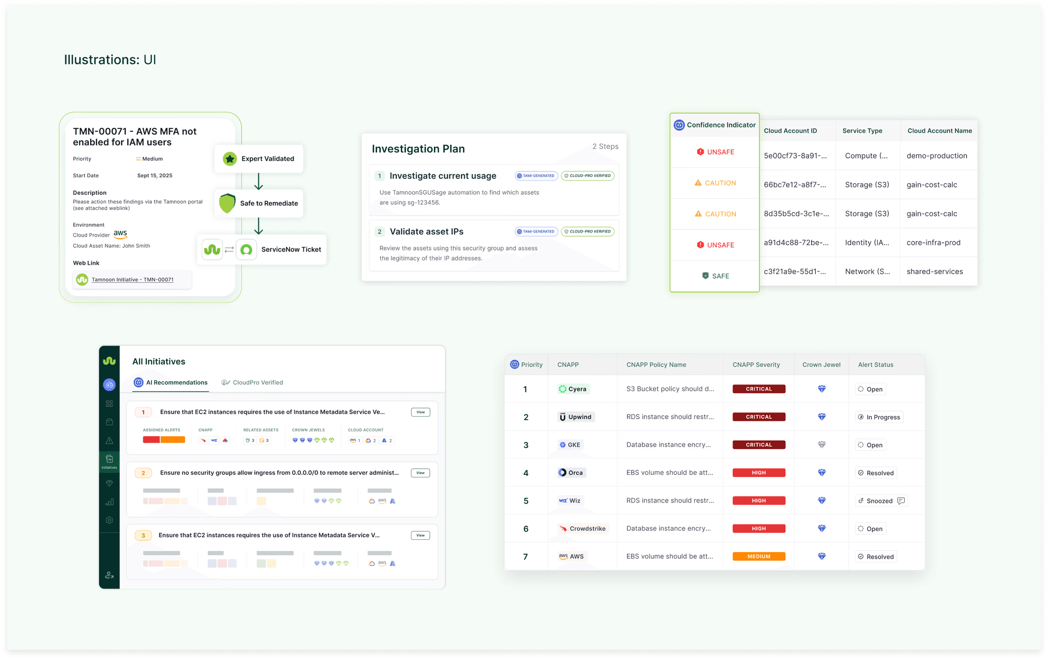
Product & Concept Illustrations
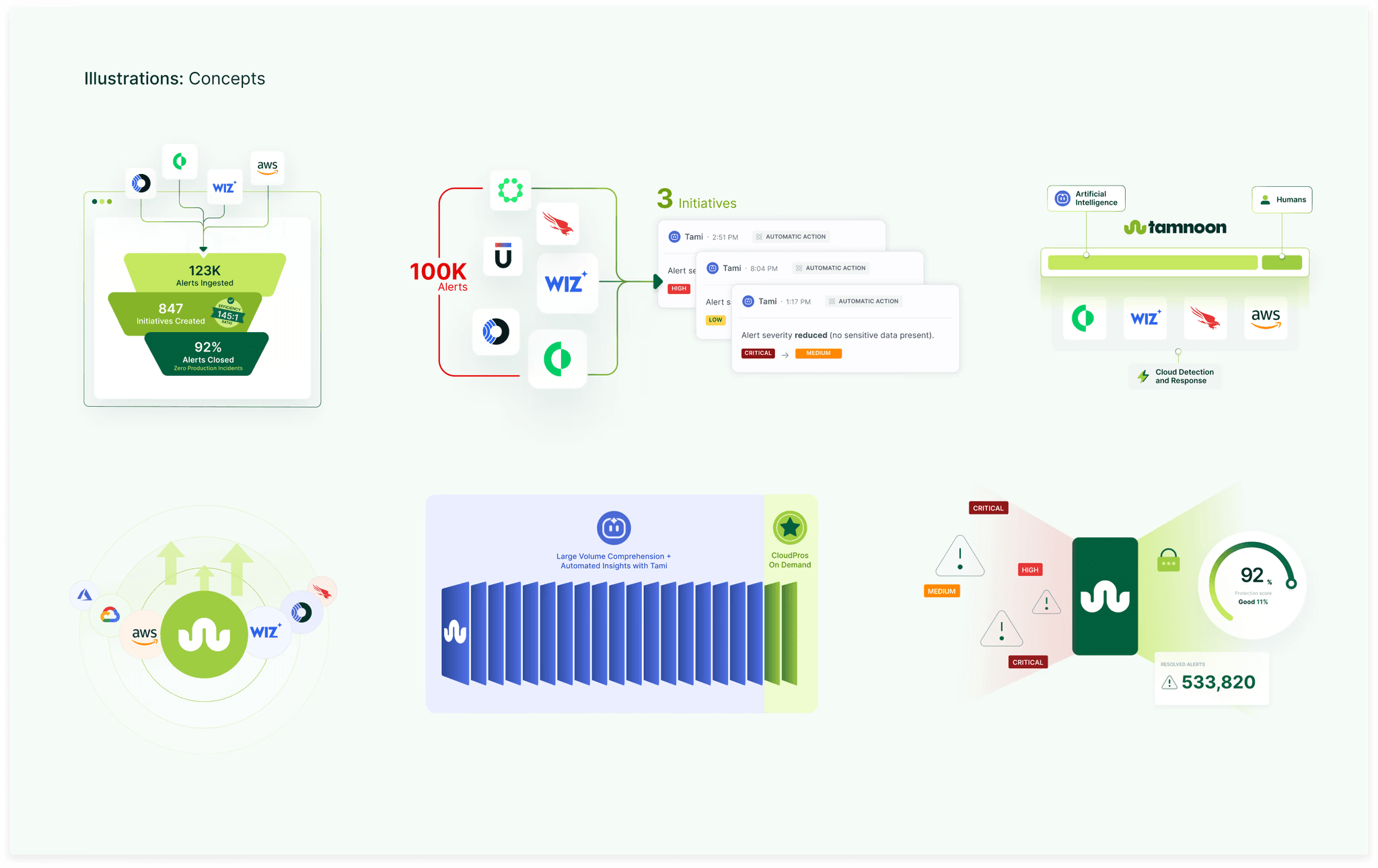
Custom visuals that communicate Tamnoon's core capabilities — ingestion, investigation, recommendations, and safe remediation — without relying on generic stock imagery.
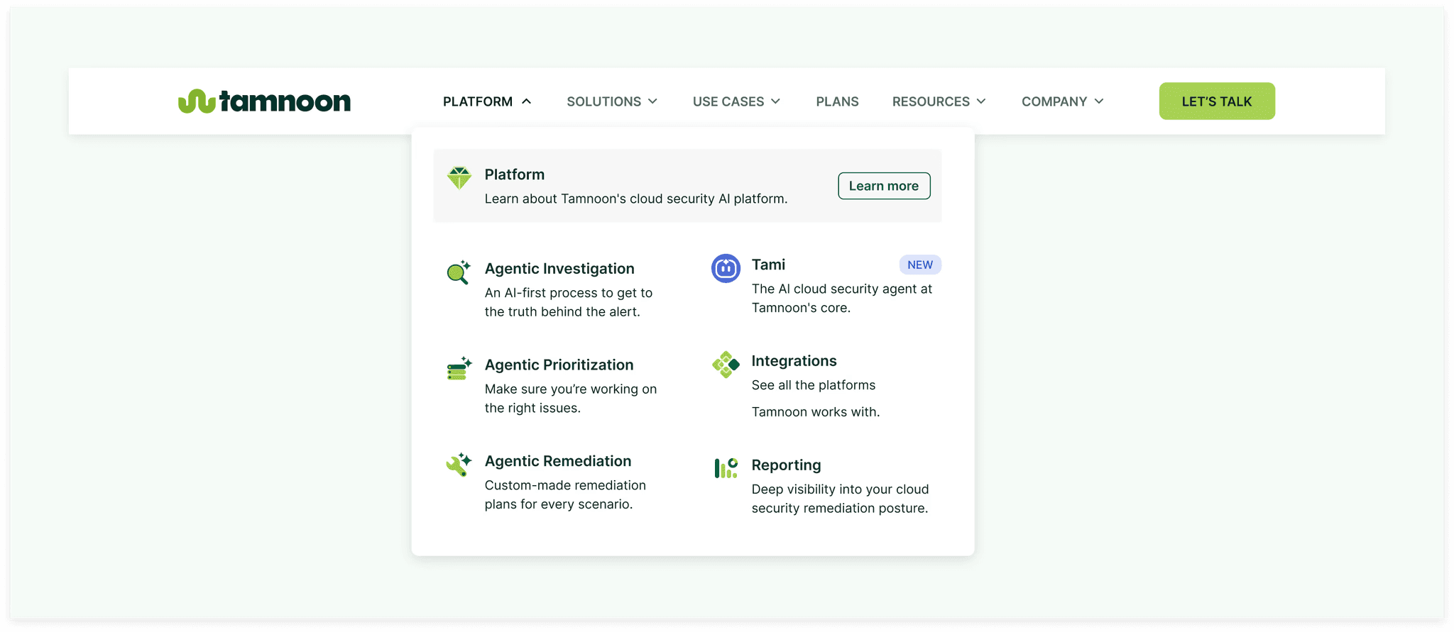
Navigation Menu
Redesigned to surface Tamnoon's product and use cases clearly, helping ICPs orient themselves and find what's relevant to them quickly.
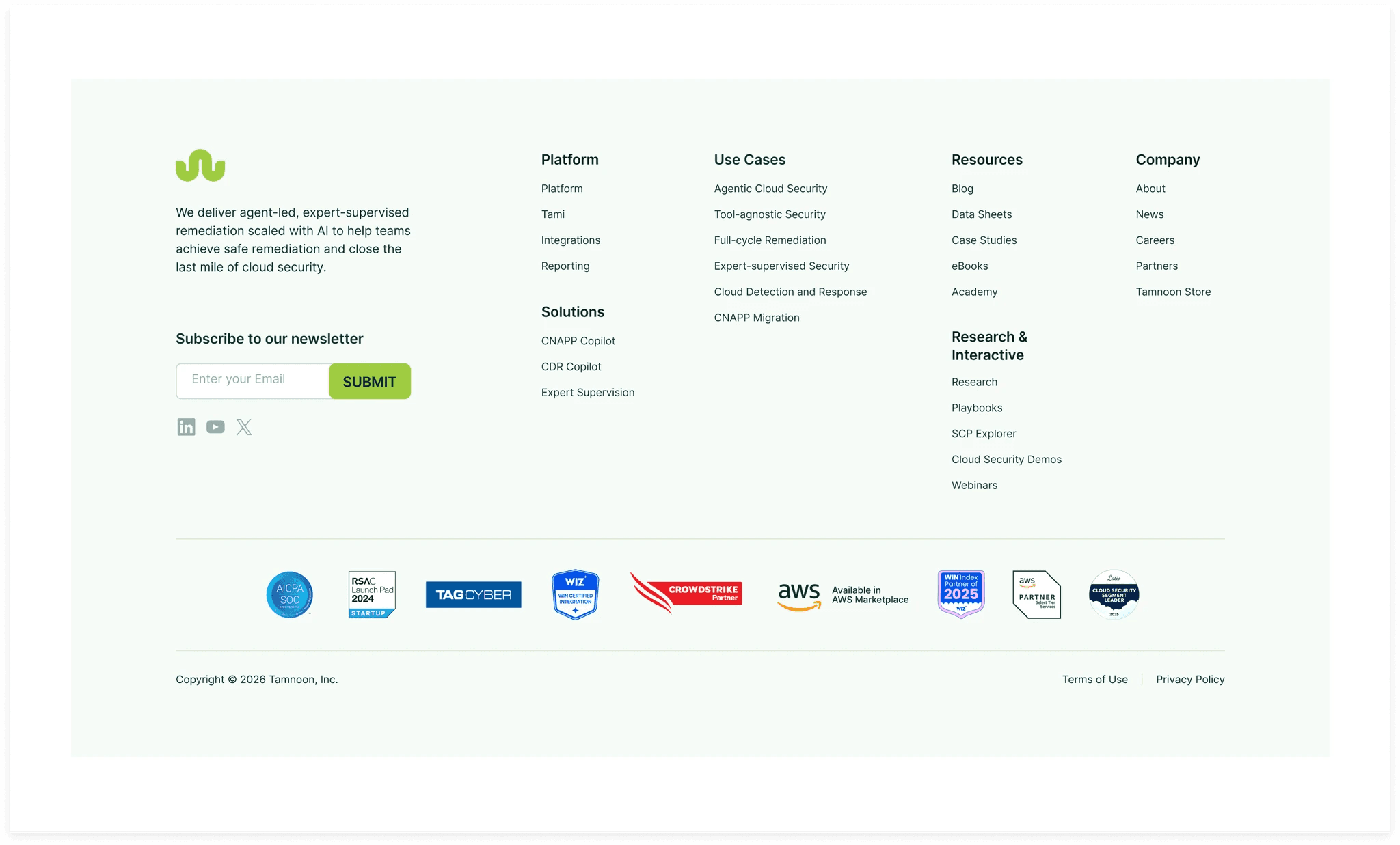
Footer
Structured and on-brand, with all the right links and a clean layout that doesn't feel like an afterthought.
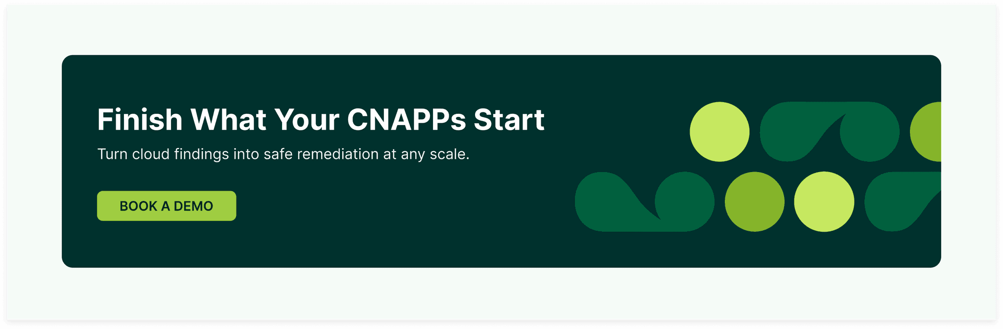
CTA Panels
Purposeful call-to-action sections designed to convert, with messaging that matches where a user is in their journey.
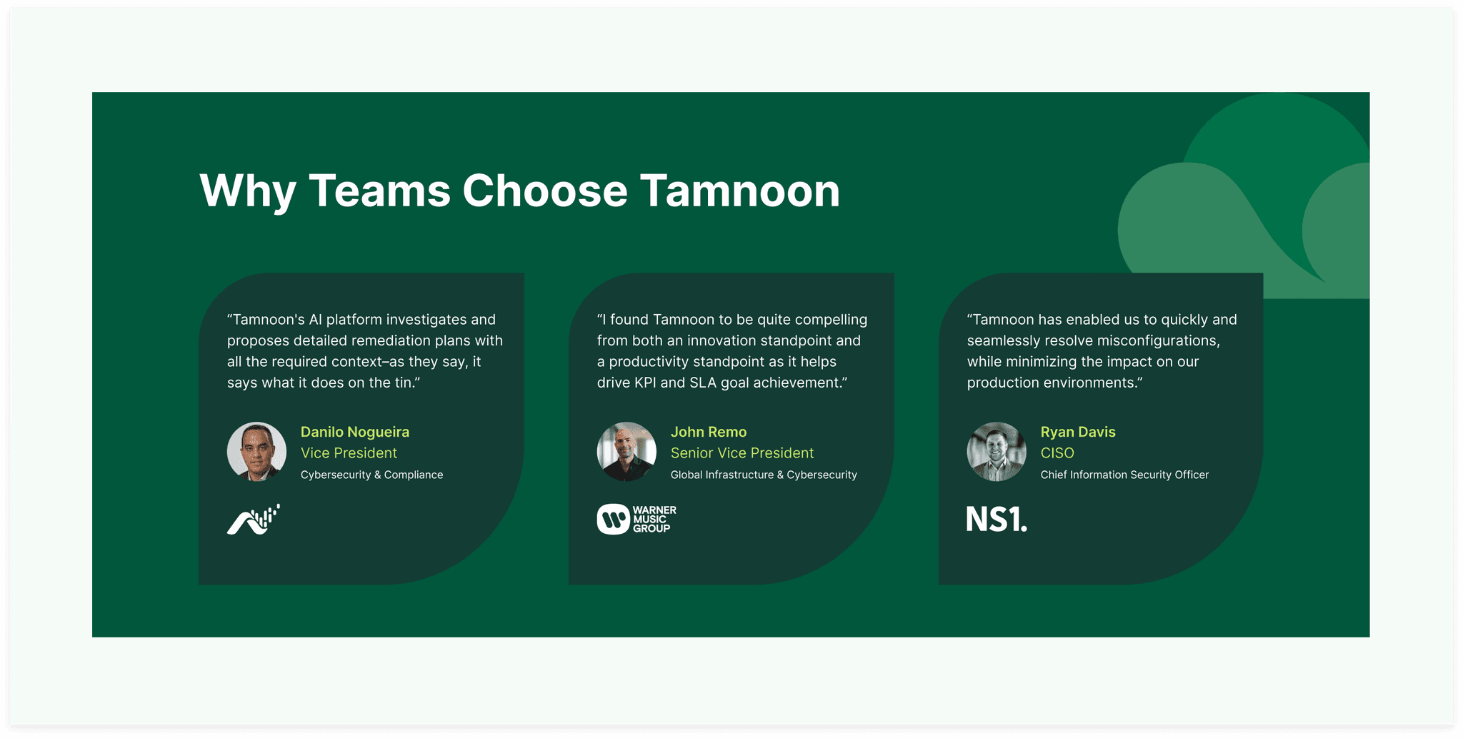
Testimonial Panels
Social proof presented cleanly, designed to build trust without cluttering the page.
Impact
45%
Increase in feature page engagement
25%
Increase in qualified website leads
35%
Decrease in bounce rate
The updated website gives Tamnoon a site that matches the quality and confidence of the brand — one that speaks clearly to security and DevOps leaders and communicates Tamnoon's unique position as the platform that finishes what CNAPPs start.

