Role
Duration
Tools
Team

Project Overview
By integrating seamlessly with existing CRMs and offering robust governance controls, Clazar enables companies to scale their cloud sales operations efficiently and securely using the Clazar platform.
Challenge
The original Clazar brand lacked distinctiveness, emotional depth, and scalability. It didn’t fully embody our core traits — a modern, innovative, tech-first organization that’s also friendly and empathetic. The team needed a visual identity that would feel bold, intuitive, and built for modern GTM teams—without leaning into generic B2B tropes.
Goals
Align the visual identity with Clazar’s new brand positioning as The Cloud Sales Acceleration Platform
Signal that Clazar is enterprise-ready and built to support the needs of large-scale, high-growth companies
Appeal to key decision-makers — Sales, Revenue, and Finance leaders — with a confident yet approachable design language
Build a cohesive brand design system that works seamlessly across digital touchpoints and in-person events
Process
The rebranding process started with the most recognizable element — the logo.
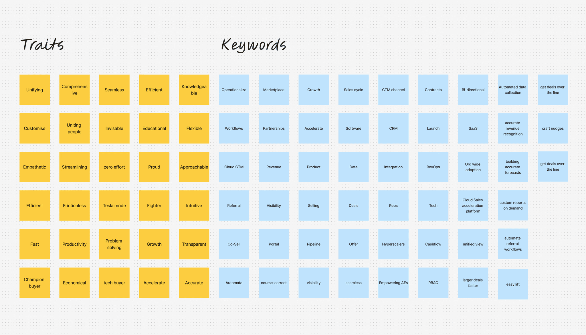
To ground the design in strategy, I collaborated closely with Clazar’s Leadership, Product, and Sales teams to understand how the company wanted to show up in the world. A key part of this discovery phase was clarifying whether we wanted to lead with technical credibility, or highlight Clazar’s empathy toward the challenges of sales and revenue generation. The answer lay in a balance of both — boldness with heart, innovation with approachability.
I translated these insights into a set of keywords that captured the brand’s intended personality and visual direction.
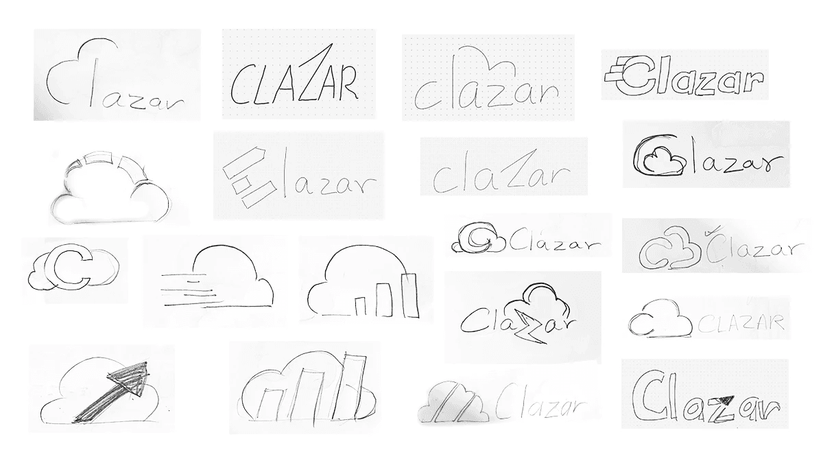
From there, I began rapid ideation — scribbling logo concepts, testing visual metaphors, and identifying typefaces that reflected Clazar’s bold, modern, and slightly rebellious spirit.
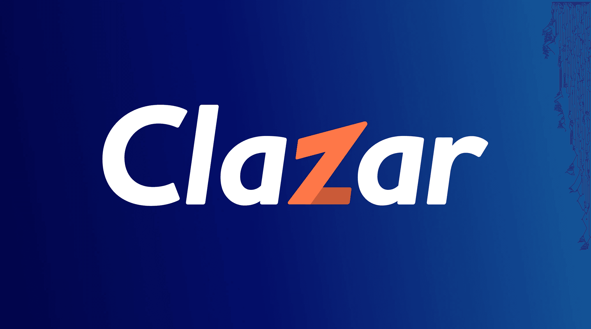
Working alongside the Marketing team, we narrowed down to a few strong contenders. The final choice? A bold, energetic logotype that signals Clazar’s confidence and clarity — a company unafraid to take risks and move fast, for itself and for its customers.
Solution Highlights
The new Clazar logo is built to embody boldness, confidence, and momentum.
We started with a strong, tightly aligned typeface that gives the wordmark a sense of solidity and gravitas — a reflection of the confidence Clazar has in its product and its purpose.
The upward stroke on the Z is a subtle but intentional detail. By raising the top-right corner, we introduced a visual cue for growth — a nod to the revenue acceleration Clazar enables for its customers.
To bring energy into the system, we added color. A deep, vibrant orange fills the arrow form within the Z, enhancing its visibility without compromising readability. The darker shade grounds the logo while still making the growth symbolism feel immediate and dynamic.
The brand palette supports this story:
Dark Blue — for knowledge, authority, and reliability
Orange — for optimism, enthusiasm, and innovation
The Results

Impact
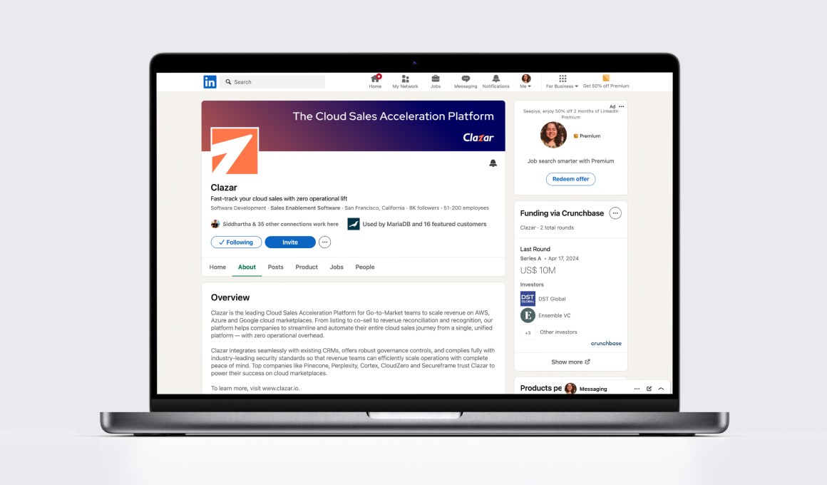
The rebrand gave Clazar a bold, distinctive presence in the B2B SaaS space — one that feels modern, enterprise-ready, and emotionally resonant.
Internally, the new identity created clarity and alignment across leadership, marketing, and product teams. It gave everyone a clear way to articulate what Clazar stands for — as a category-defining company driving the future of cloud sales.
Externally, the results have been game-changing.
Enterprise deals have tripled since the rebrand, alongside strong growth in both mid-market and SMB segments.
There’s been a noticeable increase in brand recognition and credibility across the B2B landscape.
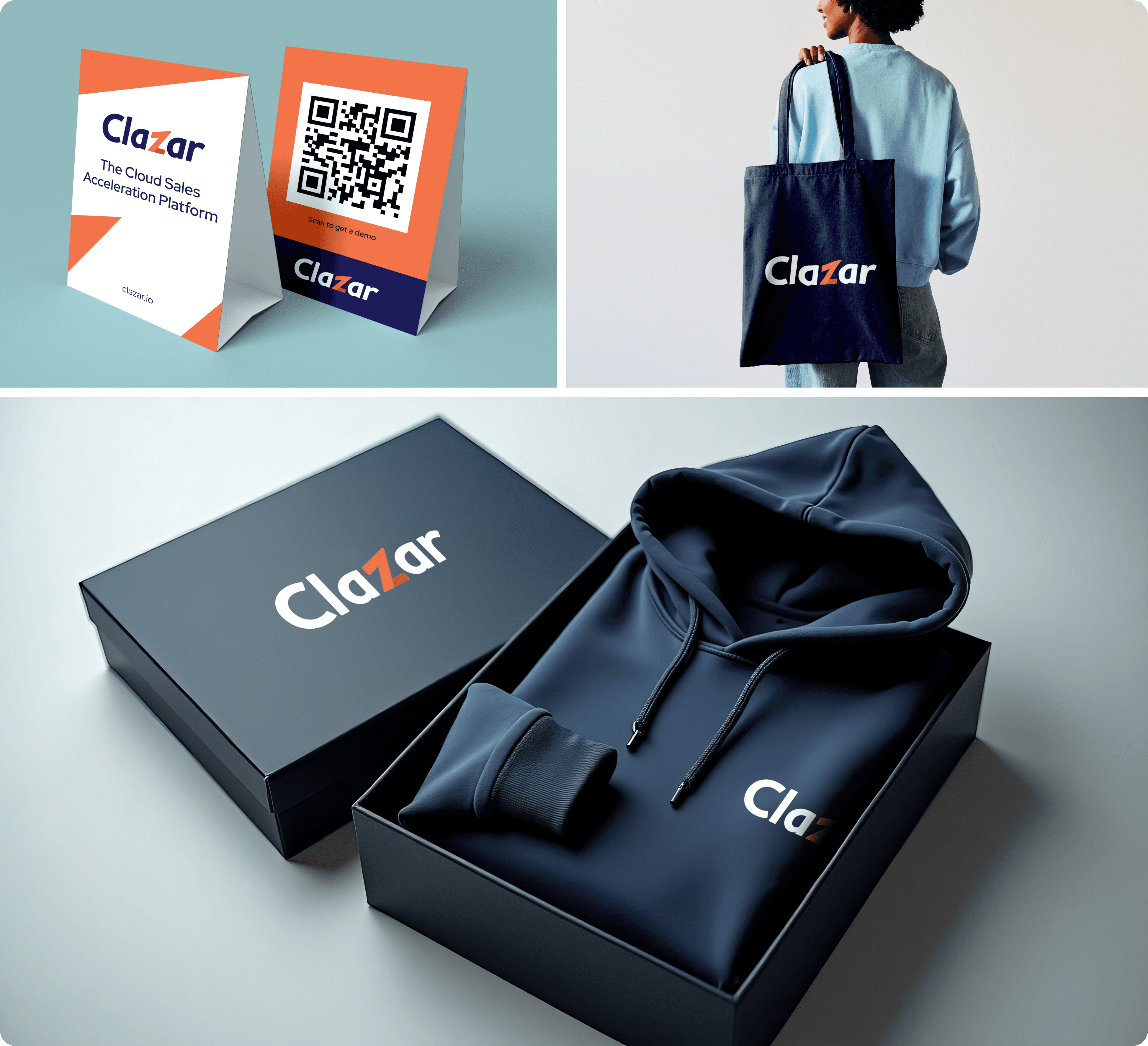
The new design system has elevated Clazar’s presence at events and across digital touchpoints — enabling the team to show up with consistency, polish, and personality.
The rebrand not only raised the bar for how Clazar is perceived — it helped unlock its next phase of growth.

